
 Three images just went off to Ross Contemporary in Chicago. If in the windy city, drop by the lower level of the cool black cube of the Zhou B Art Center.
Chicago Chicago…
Leave a reply
Three images just went off to Ross Contemporary in Chicago. If in the windy city, drop by the lower level of the cool black cube of the Zhou B Art Center.
 Zine East @ Ille Arts, Amagansett 20-21 August2016. Curated selection of limited edition zines.
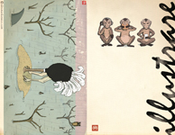
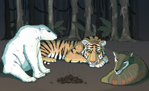
Embers of Extinction (archival pigment print editioned): sold in successful auction for a good cause; NY and East End artists. Sag Harbor.

Gallery show in Springs @ Ashawagh Hall (where deKooning and Pollock opened a bottle – or two or three – and trialled some scrappy canvases on friends and passers-by)
Open from Sat AM, reception that evening. Archival prints, editions of 11.

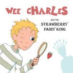
The first two books in the Wee Charles series, written by Kenneth Hughes, are now on Amazon. Available in hardback, soft cover or as an ebook. Perfect for ages 3-7, they’re full of adventure, fun and a gentle message (and hidden humour for parents reading it over and over).
Co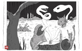 mputer is a magnificent tool – and it is just that. Happily recognised now as just one part of an illustrator’s or artist’s arsenal. I always draw my illustrations because I believe the natural feel and line of the pen is noticeable and the connection between my head and hand is more direct. Just bought an Apple Pencil so that may change with time, but for now the analog part of my process is essential. Still, the finished image is the result of far more time spent after the drawing is scanned, so there are moments when tactile image-making seems very distant. So, have begun toying with prints again, my roots – in Kyoto with woodblocks and later in London, etching at St Martin’s. Dipped into the acid a few months ago, with no forethought of the image (no idea where it came from) – approached the image as an exercise in achieving a layered aquatint effect using only stop-out and multiple bites. In NYC this week, picked up zinc plates and ground from Central Art Supply.
Good to step away from the screens now and then..
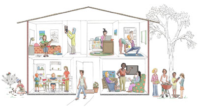
Rewarding project in every way for Bonnie’s Support Services. Illustrations for revamped website that needed to work as mural for the centre as well, as well as on printed material. Working with the excellent team at Only Human, the decision was to keep the aesthetic simple and accessible given the multicultural ‘clientele’. Sensitivity to different cultures from Aboriginal to recent migrants, avoiding cliche and imparting a sense of dignity were all important considerations.
Following July 2015’s successful launch,
the images continue to be applied in new ways
– most recently for an Xmas colouring book.
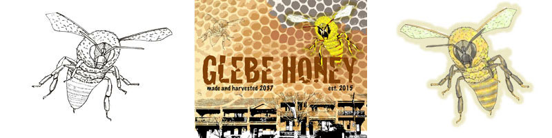
Label for Glebe Honey bees, highlighting the nectar local to 2037 Sydney. Brief was a flexible design for jars and gift boxes, bit of urban edge that needed to stand up to being printed on eco-paper.
 Very pleased to be included on Pigeonhole Books interesting blog of illustrator and author interviews. Pigeonhole aims to promote books for children which address the family and living situation realities of the 21st century. Dynamics overlooked by decades of children’s stories; yet the aim is not to highlight these situations as unusual, but bring them into the mainstream in print, reflecting their increasing visibility and normality in daily life.
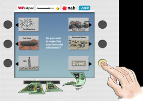 Blend of cartoon and illustration for 350.org.au – campaign to reduce global emissions to 350ppm, and generally to stop the march to climate change and environmental degradation in the name of profit. With 12 hour notice, brief was to promote campaign of divestment from Australia’s ‘big four’ banks. Image needed to read quickly yet also appeal to more engaged viewer, to both lure in the unconverted and bolster the troops. So successful locally, now to be used nationally.